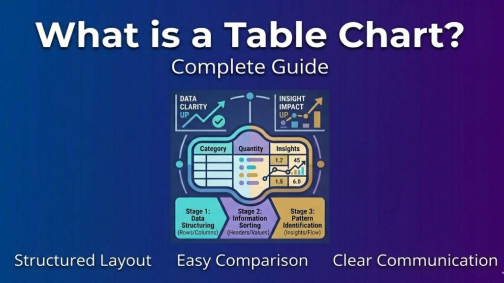
What is a Table Chart – A table chart is a structured grid of rows and columns used to display data in an organized way. It helps users quickly scan, compare, and analyze information without converting it into graphical elements like bars or lines.
How a Table Chart Works
- Rows and Columns: Data is arranged horizontally (rows) and vertically (columns).
- Labels: Headers identify categories or variables.
- Values: Cells contain numbers, text, or percentages.
- Formatting: Tables may include highlights, colors, or borders to emphasize key data.
Types of Table Charts
| Type | Description | Use Case |
|---|---|---|
| Simple Table | Basic rows and columns | Lists, schedules |
| Pivot Table | Summarizes and groups data | Business analytics |
| Comparison Table | Side-by-side values | Product features |
| Matrix Table | Shows relationships | Cross-tab analysis |
Benefits of Table Charts
- Clarity: Presents raw data in a straightforward format.
- Comparison: Makes it easy to compare values across categories.
- Flexibility: Can display text, numbers, percentages, or mixed data.
- Professional Use: Common in reports, spreadsheets, and presentations.
Also Read-What Is A Life Application Bible ?
Examples
- Business Report: Sales figures by region in a quarterly table.
- Education: Student grades organized by subject.
- Web Design: Pricing tables comparing subscription plans.
FAQs : What is a Table Chart
How is a table chart different from a graph?
A table chart shows raw data in rows and columns, while a graph visualizes data trends or patterns.
Can table charts include images or icons?
Yes, especially in comparison tables for products or services.
Are table charts interactive?
In digital formats, yes—users can sort, filter, or expand data.
What software creates table charts?
Tools like Excel, Google Sheets, and data visualization platforms.